Allen Wang • 2023-05-18
每日C ss 系列 - Tailwind 核心概念與設定

Description
在使用 Tailwind CSS 前除了知道像是在寫 inline-style 外必須知道的概念,如何管理全局樣式,會提到一些針對各種特需場景的解決方案
Concept and Config
複用樣式
Tailwind 是走一個 utility-first 的 workflow,當專案日漸增長時,必定會出現多個不同地方需要用的相同樣式,又該如何處理?
- 當用在同一個檔案時
- 就重複寫吧,不要為了看起來乾淨而去做過多的抽象化
- 用個陣列跑迴圈,實際上也只需要寫一次而已
- 當用在多個不同檔案時 (多層結構的程式碼)
- 如同現代前端框架一樣抽成元件
- 當用在多個不同檔案時 (單層 class 應用)
- 用
@apply另行抽成 class
- 用
總之保有 Tailwind 帶來的優勢是首要考量,過度的抽象化就會造成同寫原生 css class 所帶來的問題
- 還要想命名
- 多個檔案之間切換來定義樣式
- 擔心改了某 class 造成別的使用到的地方出問題
- CSS bundle 變大包
conclusion
遇到複用需求時先以元件化為優先。
特別提一下 @apply 使用,若為了某元件給一個 class 後定義樣式不如直接抽成元件,它應該應用在組合多個 utility 上但並不應該包含有數值變化的樣式 (padding、margin),否則複用彈性還是很差
e.g. (@layer 後文會提及)
@layer utilities {
  // 常見的置中需求
  .f-center {
    @apply flex justify-center items-center;
  }
  // 畫個框線
  .sky-border {
    @apply border border-solid border-sky-400;
  }
}
以下兩者等價
<div className="f-center sky-border h-[50px] w-[50px]">
  <span>OK</span>
</div><div
className="flex items-center justify-center border border-solid border-sky-400 h-[50px] w-[50px]"
>
<span>OK</span>
</div>響應式設計 (RWD)
太神啦,不用寫 @media 了,需要知道的重點不多
- mobile-first breakpoint system
- 用較大的 breakpoint 去蓋過小的設定
- 預設的 breakpoint 就很夠用了
- sm : 640px ->
@media (min-width: 640px) ... - md : 768px ->
@media (min-width: 768px) ... - lg : 1024px ->
@media (min-width: 1024px) ... - xl : 1280px ->
@media (min-width: 1280px) ... - 2xl : 1536px ->
@media (min-width: 1536px) ...
- sm : 640px ->
- 真的出現需要特殊 breakpoint 時
- 從 config 自訂新的 breakpoint
- 使用
minormaxmodifiers (個人較推)
conclusion
手機版本直接給做,從超過 640px 時候的開始思考 RWD,碰到特殊狀況直接用 min-[custom breakpoint]:style 去解決就好,也不需要為此多加設定檔
Directive & Function
Directive
@layer上文有提及到,就只是用來指向接下來所定義的樣式所屬層級@apply就是引用任何已存在的 utility 至某處
@tailwind base;
@tailwind components;
@tailwind utilities;

@layer base {
  h1 {
    @apply text-2xl;
  }
  p {
    @apply leading-loose; // 統一全站 p 標籤行高
  }
}

@layer components {
  .btn-blue {
    @apply bg-blue-500 hover:bg-blue-700 text-white font-bold py-2 px-4 rounded;
  }
}
// 上文有提及
@layer utilities {
  .f-center {
    @apply flex justify-center items-center;
  }
  .sky-border {
    @apply border border-solid border-sky-400;
  }
}
Function
該如何在我的 .css 檔案中取得 tailwind.config 所定義的樣式變數 ?
- theme() 這”僅”可以在 .css 中使用定義在 config 的 theme 變數,如果是 sass、scss、less 等等的 preprocessors 是無效的
@import 'tailwindcss/base';
@import 'tailwindcss/components';
@import 'tailwindcss/utilities';
// ✅ working
.test-in-css {
color: theme(colors.emphasize);
}
// ❌ not working
.test-in-sass
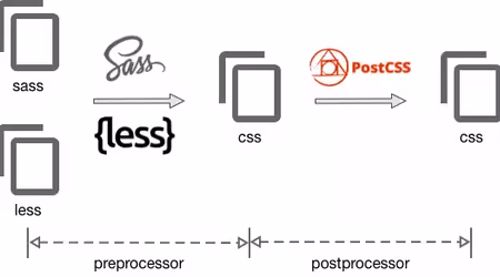
color: theme(colors.emphasize)這邊牽扯到了預處理器 (pre-processors) 及後處理器 (postProcessor) 的問題,Tailwind 本身是個 postcss 插件,這意味著我們所寫的是 CSS 再透過 plugin 轉成瀏覽器能懂的指令,跟預處理器所寫的類似 CSS 語法再編譯成 CSS 兩者不一樣時機點也不同。
Sass、Less 和 Stylus 等預處理器在 Tailwind 之前單獨運行。這代表著我們無法將 theme function 提供給 sass,因為 theme function 在 sass 被編譯成 CSS 後並提供給 PostCSS 之前,該 function 實際上並不存在。
扯一堆,反正就是其實不太需要用預處理器啦,官方文件也是這麼建議的,實際上會需要寫在 CSS 的東西應該要很少,如果專案用了 Tailwind 還配了 sass 寫了一堆自訂的 class 的話,那就是有點偏離使用 Tailwind 的本意了,請你 refactor 一下,謝謝
 網路參考圖
網路參考圖
Referencing in JavaScript
該如何在我的 .css 檔案中取得 tailwind.config 所定義的樣式變數 ?
在實際開發中時常出現的模式,會需要在元件中使用(寫 JS)設定好的樣式,以 MUI 舉例來說,就有提供了 ThemeProvider 來使底下元件得以獲取設定的樣式,不過這之中的 theme 是用了 createTheme 所建立出來的物件,也就是 CSS in JS 的類型
<ThemeProvider theme={theme}>
  <App />
</ThemeProvider>
如何獲取 Tailwind 設定檔案中的樣式官方亦有提供解決方案
import resolveConfig from 'tailwindcss/resolveConfig';
import tailwindConfig from '/tailwind.config.js';

const fullConfig = resolveConfig(tailwindConfig);
用 fullConfig.theme 這樣就可以取得設定檔中的樣式,有在 Next.js 專案中使用過,不過這個 astro 架的這個部落格沒辦法用,可能是 vite 跟支不支援 module 的緣故,還有新版的 tailwind.config 會是 .cjs 檔可能也有差,現在不知道怎解之後再研究看看
 好煩
好煩
conclusion
從最早的純 CSS 寫到 sass/scss 再有了 OOCSS 或 BEM 的寫法,都是為了解決專案越來越複雜所帶來的 class name 問題,到前端框架中後有了元件概念,有了 css module、styled-component 這類 CSS-in-JS 的作用域解法。相比之下各有優裂,雖然在樣式管理方面 Tailwind 有肥肥醜醜的 inline 寫法,不過實際使用過後感覺它算是挺全面的,稍微花點時間讀一下官方文件,用正確的方式使用 Tailwind 對開發很有幫助